
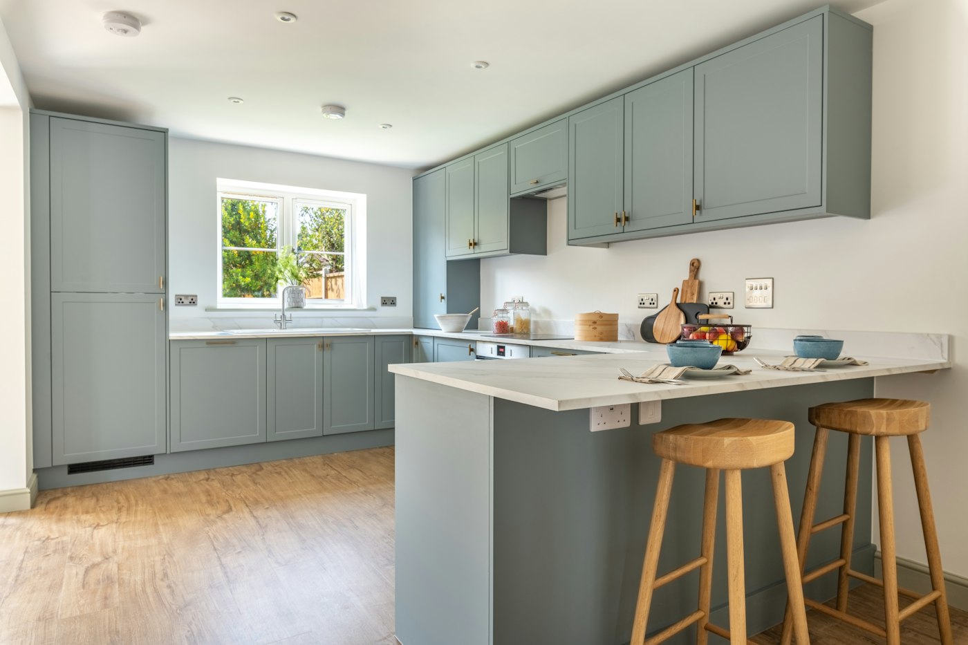
A kitchen is a composition of a dozen surfaces: floor, cabinets, counters, backsplash, walls, hardware, appliances, lighting and the small things that live on the counter. Each is chosen separately, often weeks apart, and the result either reads as one room or as a collection of individually good decisions that never met. A palette is what makes them meet. Here is a practical way to build one.
Start With What Is Fixed
Begin with the elements that are hardest to change and have the least color flexibility. Flooring is usually first, especially if it continues from other rooms. Countertops come next, since stone and quartz come in a finite set of colors and patterns. If appliances are staying, their finish is a given. These fixed elements set the undertones for everything else. A warm oak floor and a cream-veined counter point toward a warm palette; a gray slate floor and a white quartz counter lean cool. Fighting those undertones is the most common reason a kitchen feels off.
Choose a Dominant, a Secondary and an Accent
Most pleasing rooms have a clear hierarchy. One color or material dominates, often the cabinets, since they cover the most wall area. A secondary color supports it, frequently the countertop and backsplash or a contrasting island. A small accent adds life: hardware, a painted range, stools, a bowl of lemons. A rough proportion of mostly dominant, some secondary and a little accent keeps the eye calm. Two colors fighting for dominance, such as a bold island and a bold backsplash, create visual noise.
Decide on Warm, Cool or Mixed
Whites and neutrals are not neutral at all. A white can lean yellow, pink, gray or blue, and placing a cool white cabinet against a warm white counter makes one of them look dirty. Pull together samples of every white and neutral in the kitchen and look at them side by side in the room’s own light. Either keep them in the same temperature family or create deliberate contrast, such as warm wood against cool white, which reads as a choice rather than a mismatch.
Let the Walls Come Last, and Test in Real Light
Wall paint is the most flexible element and the cheapest to change, so it should respond to everything else rather than lead. In many kitchens the walls are mostly covered by cabinets and backsplash, and the paint simply needs to recede. Choose it with the cabinet door sample, the counter chip and the backsplash tile in hand, and test large swatches on more than one wall, viewed morning and evening.
- Bring samples home; showroom lighting flatters everything.
- Look at them on the horizontal and vertical surfaces they will occupy, since light hits a counter differently than a door.
- Check them under your actual bulbs at night, when a warm LED can shift a gray toward green.
- Live with the final set for a few days before ordering.
Metals, Wood and Texture
Color is only part of a palette. Metal finishes on hardware, faucet and lighting should relate to each other and to the temperature of the room: brass and bronze warm a space, chrome and nickel cool it, black grounds almost anything. Wood tones count as colors and should be limited to one or two. Texture carries weight too; a matte cabinet, a honed counter and a glossy tile each reflect light differently and keep a one-color kitchen from feeling flat.
A palette built this way is not a formula but a set of guardrails. Within them, there is room for personality, and the kitchen that results will feel like one idea rather than many.
Building a Sample Board, Step by Step
The most reliable tool for pulling a kitchen palette together is a physical sample board. It turns a stack of separate decisions into one view you can carry from room to room and look at in every kind of light.
- Gather real samples. Collect a floor plank or tile, a counter chip or remnant, a cabinet door or finish sample, the backsplash tile, a hardware sample and any paint chips you are considering.
- Arrange them in proportion. Give the cabinet sample the most space on the board, the counter and backsplash less, and the hardware and accent colors only a small corner. This mirrors how much of each you will see in the room.
- Set it in the kitchen. Prop the board where the counter will be and look at it at different times of day.
- Remove what fights. If one sample keeps catching your eye in the wrong way, take it off and try alternatives until the group feels settled.
- Photograph it. A photo in black and white quickly shows whether you have enough contrast between light and dark elements.
- Bring it to meetings. Carry the board to showrooms and appointments so every new choice is made beside the ones already set.
Palettes That Work in Real Kitchens
These combinations are starting points, not formulas, but they show how a dominant, secondary and accent can come together.
- Warm and classic. Creamy white cabinets, a warm-veined counter, a medium oak floor and aged brass hardware, with a soft greige wall.
- Cool and crisp. Pale gray or white cabinets, white quartz, a gray-toned floor and polished nickel or chrome, with a slightly darker painted island.
- Grounded and natural. Wood cabinets on the perimeter, a painted island in deep green or blue, a honed stone counter and black or bronze hardware.
- Quiet contrast. White upper cabinets or open shelves, darker lower cabinets, a light counter and a simple white or cream backsplash.
Common Palette Mistakes
- Choosing everything from small chips. Colors intensify over large areas. A cabinet color that looks soft on a tiny sample can feel strong across a whole wall.
- Too many woods. Floor, cabinets, table and shelving in four different wood tones can feel chaotic. Keep to one or two and let them contrast clearly.
- Ignoring adjoining rooms. In open plans, the kitchen palette should relate to the living and dining areas it can be seen from.
- Forgetting the appliances. Stainless, black, white and panel-ready appliances all change the balance of the room.
- Matching too perfectly. A kitchen with everything in the same shade can feel flat. Vary value and texture even within a narrow color range.
Questions Homeowners Ask
Should the island match the cabinets?
It can, for a calm, unified look, or it can contrast for interest. If it contrasts, repeat its color or material somewhere else, such as stools or a shelf, so it feels connected.
How bold can we go?
Bold colors are easiest to live with on elements you can change, such as paint, stools and accessories. On permanent surfaces, a bold choice works best when everything around it is quieter.
Can we keep our existing floor?
Yes. Treat it as the first fixed element and build the palette around its undertone. We are glad to help you pull samples together and see how they work in your space.